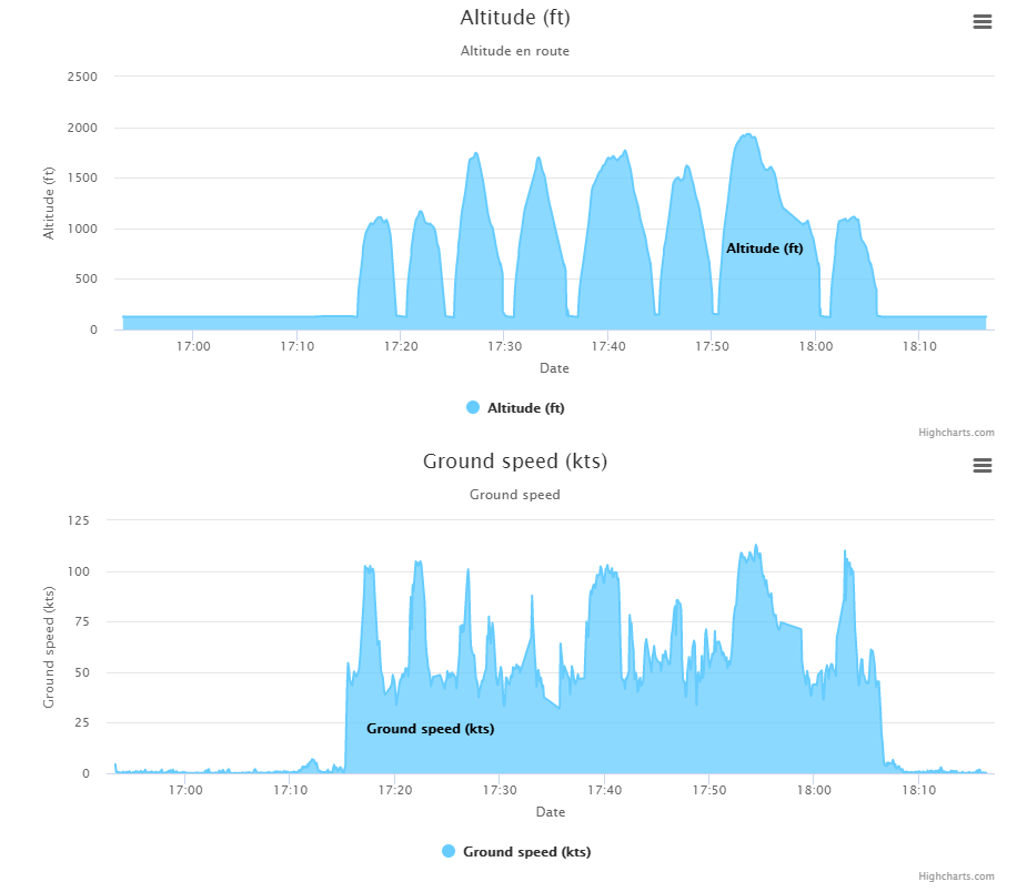
I made a thing for my other blog to show the GPS track of my flights. Part of this is showing the altitude and speed profiles:
I thought I'd write down how I did it.
Getting the Data
Have a look at my previous blog post to find out how I record the GPX track and get the data into JavaScript.
For this post, it's enough to know I end up with a parsed GPX structure:
  let gpx = new gpxParser();
  gpx.parse(gpxData);
  drawAltitudeChart(gpx.tracks[0]);
The "magic" happens in the drawAltitudeChart function. Although the real magic actually happens in the HighCharts component.
Embedding HighCharts
To show the graphs, I use a third party javascript component HighCharts, which is free for non-profit and personal use.
Before we look at the details of drawAltitudeChart, which prepares the gpx data for the altitude profile, here's how to load up HighCharts:
Load the appropriate JavaScript:
<script src="https://code.highcharts.com/highcharts.js"></script>
<script src="https://code.highcharts.com/modules/series-label.js"></script>
<script src="https://code.highcharts.com/modules/exporting.js"></script>
Add a div as a place-holder for where the chart must appear:
<div class="chart" id="altitude"></div>
Preparing the Data
The first thing drawAltitudeChart is take the data from the gpx track and restructure it in a way that makes sense for the altitude chart.
What I need for that chart is a series of timepoints and the altitude at that time:
let dataPoints = track.points.filter(p => p.time !== null).map(p => [p.time, p.ele * 3.28084]);
I use some fancy JavaScript stuff like filter and map. filter is a function that can be executed on an array and will return a new array with only the items for which the given condition is true.
In my case I'm looking for points that have a time filled in. Because I noticed this happened sometimes.
With map I transform each element in the array of points into a new element - in my case a second array of a time and an elevation.
I multiply with 3.28084 because I want the altitude in ft (feet) and the gpx track has the altitude in meter. 1 meter is 3.28084 ft.
Showing the Chart
With the array of time-altitude pairs, the chart can be loaded. HighCharts offers many options, so it was quite the setup in the end.
Highcharts.chart('altitude', {
    chart: {
        type: 'area'
    },
    title: {
        text: 'Altitude (ft)'
    },
    subtitle: {
        text: 'Altitude en route'
    },
    xAxis: {
        type: 'datetime',
        dateTimeLabelFormats: {
            month: '%e. %b',
            year: '%b'
        },
        title: {
            text: 'Date'
        }
    },
    yAxis: {
        title: {
            text: 'Altitude (ft)'
        }
    },
    tooltip: {
        headerFormat: '<b>{series.name}</b><br>',
        pointFormat: '{point.x:%e. %b %H:%M}: {point.y:.2f} ft'
    },

    plotOptions: {
        spline: {
            marker: {
                enabled: true
            }
        }
    },

    colors: ['#6CF', '#39F', '#06C', '#036', '#000'],

    series: [{
        name: "Altitude (ft)",
        data: dataPoints
    }],

    time: { useUTC: false }
});
There are several types of charts, I like the look of the area chart.
chart: {
    type: 'area'
},
The x-axis in my chart represents time, the object in javascript is of type Date, which HighCharts can understand if the x-axis type is datetime
xAxis: {
    type: 'datetime',
    dateTimeLabelFormats: {
        month: '%e. %b',
        year: '%b'
    },
    title: {
        text: 'Date'
    }
},
With the plot options it's possible to specify the line chart should show a spline, which smooths the segments between data points.
plotOptions: {
    spline: {
        marker: {
            enabled: true
        }
    }
},
The colours for the chart I kept fairly standard.
colors: ['#6CF', '#39F', '#06C', '#036', '#000'],
Here's where I actually load in my data points. I also give the chart a name here. It's possible to load more than one series.
series: [{
    name: "Altitude (ft)",
    data: dataPoints
}],
This time setting was important because by default HighCharts shows the time in UTC. Which is not as interesting in my case.
time: { useUTC: false }
Conclusion
If you have a series of time-value pairs, you can use HighCharts to plot these in a chart, with a small amount of configuration.
HighCharts is free to use for non-profit and personal use.
